You spend months perfecting your beverage recipe. You source the best beans or the freshest fruit. But then, customers complain that it tastes "cheap" or "different." This is frustrating. The problem might not be the liquid inside. The problem is often the cup you put it in.
Yes, packaging significantly alters perception. Research proves that material texture, weight, and visual clarity prime the human brain before the first sip. Heavy glass or sturdy compostable cups suggest premium quality and better taste. Conversely, flimsy plastic or rough paper suggests cheapness. Visual cues like transparency also trigger flavor expectations. For brands, the vessel is just as important as the ingredients.
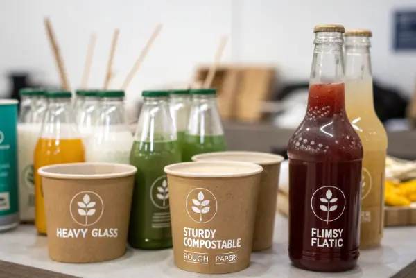
We need to understand this psychology to sell more products. Let’s look at the specific factors that change how a drink tastes.
Does the texture of the cup influence the taste of the drink?
We have all held a cup that felt wrong. Maybe it was too soft, or the rim was rough against our lips. You notice this immediately. It makes you worry about the drink spilling. It distracts you from the flavor. This is a bad customer experience.
Texture transfers physical sensations directly to taste perception. Studies show that smooth, sturdy materials enhance the perception of sweetness and body. Rough or thin edges can make a drink feel thinner or more acidic to the drinker. In the eco-friendly sector, high-quality PLA or smooth bagasse mimics premium plastic, maintaining a positive taste perception compared to low-quality alternatives.
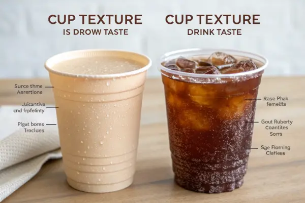
We call this "sensation transfer." It is a concept I talk about often with my clients. The idea is simple. The consumer transfers the feelings they get from the package to the product itself. If the package feels high quality, they think the drink is high quality. If the package feels cheap, the drink tastes cheap.
This happens most critically at the lips. The rim of the cup is the first point of contact. I have seen many brands fail because they chose a lid with a sharp, uncomfortable edge. A smooth, rounded rim makes the drink feel creamy and luxurious. A sharp rim makes the drink feel harsh.
This is very important for eco-friendly products. Some early paper cups had a very rough texture. They got soggy quickly. This ruined the "mouthfeel" of coffee. Now, we use materials like PLA (Polylactic Acid). It feels smooth and rigid like traditional plastic. It does not absorb the liquid. This protects the flavor profile.
Below is a breakdown of how different materials affect the tactile experience:
| Material Type | Tactile Sensation | Perceived Quality | Suitable For |
|---|---|---|---|
| Thin Plastic (PET) | Flimsy, crinkles easily | Low / Budget | Quick service, water |
| Rigid PLA (Bioplastic) | Smooth, firm, cool | High / Premium | Smoothies, iced coffee |
| Single-wall Paper | Rough, gets hot/soft | Medium / Standard | Hot coffee (needs sleeve) |
| Double-wall Paper | Smooth, sturdy, insulated | High / Premium | Specialty hot drinks |
| Bagasse (Sugarcane) | Textured, natural feel | High / Eco-conscious | Takeout containers, cups |
You must choose a material that matches your price point. If you sell a five-dollar coffee, you cannot use a one-cent cup. The texture must match the expectation.
Do clear cups actually make drinks taste fresher?
You make a beautiful, colorful fruit smoothie. Then you put it in a brown, opaque cup. The customer cannot see the red berries or the green spinach. They buy less of it. They also report that the flavor is less intense. Why does hiding the drink hurt the taste?
Visual access is crucial for perceived freshness. Clear packaging allows consumers to verify the quality and color of the beverage, which primes the brain for specific flavors. For example, seeing the vibrant red of a strawberry drink increases perceived sweetness. Opaque cups often reduce flavor intensity unless the branding on the cup is very strong.
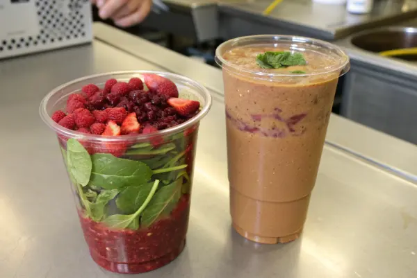
We eat and drink with our eyes first. This is biology. Our ancestors needed to see food to know if it was safe. Today, we use color to predict flavor. If I see a bright orange drink, my brain prepares for citrus flavor. It prepares for acidity and sweetness. If I cannot see the drink, my brain is not ready.
This leads to a disconnect. I have helped juice bars switch from paper cups to clear PLA cups. The sales usually go up. The customers also stop complaining about the drink being "too sour." When they can see the rich color, they perceive it as sweeter.
This is tricky for sustainable brands. Often, "eco-friendly" means brown kraft paper. This is good for hot coffee. It signals "earthy" and "warm." But for cold drinks, clarity is king.
Here are the visual cues you need to manage:
1. Transparency vs. Opacity
- Clear (PLA/PET): Best for cold drinks with layers, colors, or fresh fruit pieces. It screams "fresh" and "made now."
- Opaque (Paper/Bagasse): Good for hot drinks where safety (heat protection) is more important than visuals. Also good for "mystery" flavors or very consistent brands.
2. Color Saturation
If you must use an opaque cup, the color of the cup matters.
- White: Clean, pure, simple.
- Brown/Kraft: Natural, organic, eco-friendly.
- Black: Premium, serious, intense (often used for strong coffee).
I always advise clients to think about the ingredients. If your selling point is fresh ingredients, hide nothing. Use clear, compostable options. If your selling point is warmth and comfort, use textured paper. Do not confuse the customer’s eyes. It will confuse their tongue.
Does a heavier cup make a beverage feel more expensive?
Imagine you pick up two cups of tea. They look the same. But one feels very light, almost like air. The other feels solid and has some weight. You automatically assume the heavier one is better. You might even be willing to pay more for it.
Weight correlates directly with value in consumer psychology. A heavier, more rigid container signals high density and premium ingredients. Lightweight, crinkly cups suggest cost-cutting and low quality. Brands charging a premium must use packaging that offers resistance and substance in the hand to justify the price tag.
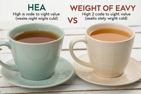
This is called the "Need for Touch" in marketing psychology. We associate mass with value. Think about a heavy glass bottle vs. a thin plastic bottle. The glass feels expensive. The same rule applies to disposable cups.
When a customer picks up a flimsy cup, they feel the walls buckle. This signals "danger." They worry it will break. This anxiety lowers their enjoyment of the product. A rigid cup signals "safety." They can relax. When they relax, they enjoy the flavor more.
I have seen this with double-wall paper cups versus single-wall cups. The double-wall cup is heavier. It feels substantial. Even if the coffee inside is identical, customers rate the double-wall coffee as having a "richer" taste. They feel they got more for their money.
This is where material density matters.
- Low Density: Thin plastic, cheap foam. Feels airy.
- High Density: Thick paperboard, molded fiber (bagasse), rigid bioplastics. Feels solid.
The Role of Resistance
It is not just dead weight. It is resistance to squeezing. When you squeeze a cup, does it fight back?
- High Resistance: The cup keeps its shape. The customer feels secure. This denotes a "Premium" tier.
- Low Resistance: The cup squishes. The lid might pop off. This denotes a "Budget" tier.
We provide bagasse products that are very dense. They have a good weight. They feel like real dishware compared to thin paper plates. For our clients in the catering business, this is huge. It allows them to serve high-end food on disposable plates without it feeling cheap. You must match the weight of the package to the weight of your brand promise.
Can eco-friendly labels improve the perceived quality of the product?
Consumers are changing. They are more aware of waste than ever before. They feel guilty about using plastic. You might wonder if this guilt changes how the drink tastes. Does a "Green" label make the coffee taste better?
Sustainability is now a quality cue. Modern consumers often associate "green" packaging with natural, healthy, and high-quality ingredients. A certified compostable cup tells the user that the brand cares about details. This "halo effect" can actually make the product taste better and healthier to the conscious consumer.
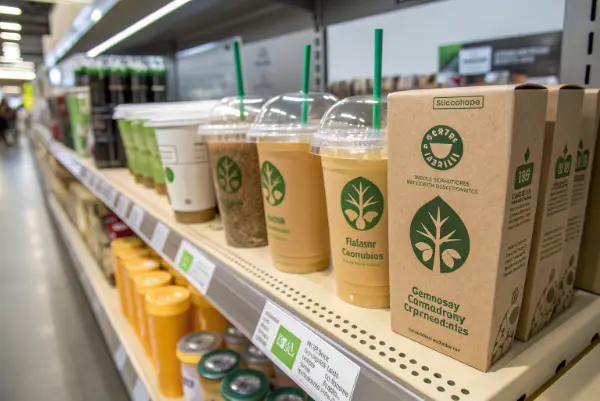
We call this the "Halo Effect." If a brand does one good thing (like using eco-packaging), consumers assume they do other good things (like using healthy ingredients).
I have worked with many juice brands in Canada and Europe. When they switched to cups with visible eco-certifications (like BPI or seedling logos), their customer feedback changed. People started describing the product as "cleaner" and "more natural."
The packaging told a story before the drink did. It said: "We care about the earth, so we definitely care about your health."
However, this only works if the packaging actually performs well. If you use a paper straw that dissolves in two minutes, the Halo Effect vanishes. It is replaced by frustration. The key is to use high-performance sustainable materials.
The Trust Matrix
You can break down consumer trust into three levels:
- The Skeptic: They think eco-products are just marketing. They care about price and function. If the cup works, they are happy.
- The Aspirational: They want to be green but don’t want to sacrifice quality. They love the look of kraft paper or the idea of PLA.
- The Activist: They check for certifications. They know the difference between "biodegradable" (vague) and "compostable" (specific).
To win all three, you need clear labeling.
- Print the certification: Don’t just say "Eco." Put the EN13432 or ASTM D6400 mark on the cup.
- Use the right words: "Made from Plants" or "Commercially Compostable."
This psychological connection is powerful. It allows you to charge a premium price. Consumers are willing to pay more for the emotional satisfaction of doing good. It makes the drink taste like "moral victory." That is a flavor you cannot bottle, but you can package it.
Conclusion
Packaging is not just a container. It is an active ingredient in your beverage. The texture, the weight, the clarity, and the environmental message all change how your customer experiences the flavor. If you use flimsy, cheap materials, your product will taste cheap. If you use sturdy, clear, and certified sustainable materials, your product will taste premium. You must choose packaging that elevates your hard work, not hides it.


